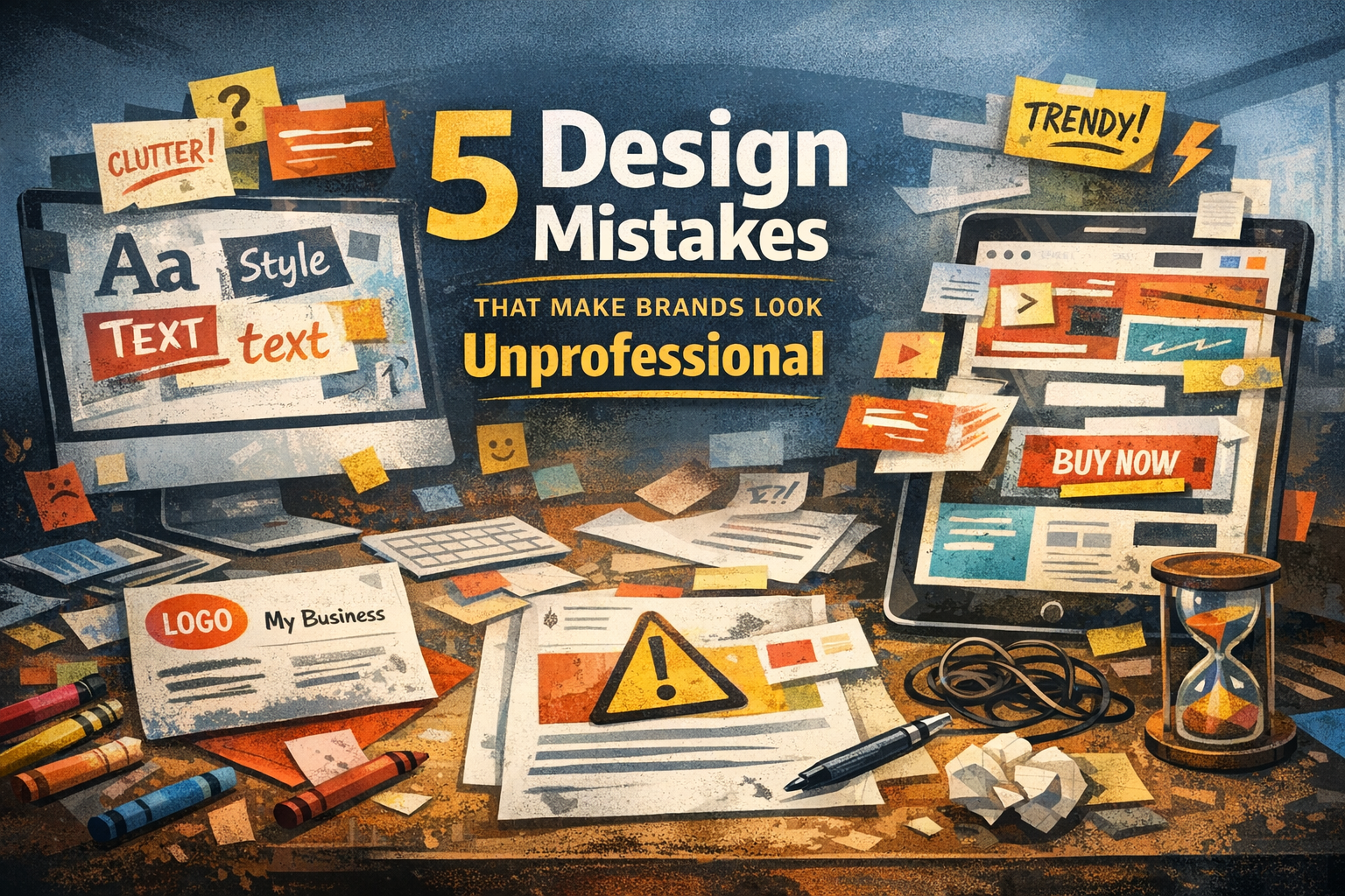
5 Design Mistakes That Make Brands Look Unprofessional
Good design builds trust. Bad design breaks it — often in seconds. Many brands invest time and money into their products, but overlook how design affects perception. Here are five common design mistakes that instantly make a brand look unprofessional — and how to avoid them.
Seyda Sahin
5/8/20241 min read
1. Inconsistent Visual Identity
Using different colors, fonts, and styles across platforms confuses your audience.
A strong brand should feel recognizable everywhere — website, social media, packaging, and video.
Fix it:
Create a clear visual system and use it consistently.
2. Poor Typography Choices
Too many fonts, hard-to-read typefaces, or bad spacing can ruin even a good design. Typography is not decoration — it’s communication.
Fix it:
Limit your font choices and focus on readability and hierarchy.
3. Overdesigned Layouts
More elements don’t mean better design. When everything tries to stand out, nothing does. Cluttered layouts overwhelm users and hide the message.
Fix it:
Use white space intentionally and let key elements breathe.
4. Ignoring User Experience
Design that looks good but feels confusing quickly loses trust. If users struggle to find information, they leave — no matter how beautiful the visuals are.
Fix it:
Design with the user in mind first, visuals second.
5. Following Trends Blindly
Trends fade fast. Brands that rely too heavily on them often look outdated just as quickly.
Fix it:
Use trends carefully, but build your design on strong, timeless principles.
Final Thought
Professional design isn’t about being flashy — it’s about being clear, intentional, and consistent. If your brand visuals feel confusing or outdated, it might be time for a thoughtful redesign.
Brand
Explore our sleek website template for seamless navigation.
Contact
Newsletter
contact@studiobyseyda.com
426-725-2981
© 2015. All rights reserved.